
How to Optimize Website Loading Speed: A Complete Performance Guide for Improving Website Performance and Core Web Vitals
Website loading speed measures how quickly a page becomes usable and visually complete for visitors, and it directly affects user experience, search performance, and conversion rates. This guide explains practical techniques for improving website loading speed, ties each recommendation to Core Web Vitals, and maps audits and monitoring approaches so you can prioritize work effectively. Readers will learn what Core Web Vitals measure, how images and media influence load time, concrete front-end optimizations for CSS and JavaScript, server-side strategies like CDNs and caching, and the tools to audit and continuously monitor performance. The article also highlights how diagnostic tools from Google LLC fit into an ongoing performance workflow without prescribing any vendor lock-in. Start by understanding the key metrics that define perceived and measured speed, then move through asset-level, code-level, and infrastructure-level optimizations so you can reduce LCP, minimize input latency, and shrink layout shifts.
Further emphasizing the comprehensive nature of performance, research underscores the critical role of front-end optimization in enhancing user experience and achieving business objectives.
Front-End Optimization for User Experience & Core Web Vitals
AbstractFront-end performance optimization represents a critical business imperative for organizations developing next-generation digital services in an environment where user expectations continue to rise. This technical article explores how performance optimization directly impacts user satisfaction, conversion rates, and revenue across digital platforms. It explores the evolution of performance measurement through Core Web Vitals, evaluates advanced code splitting strategies, and discusses emerging technologies like WebAssembly for near-native browser performance. The article also covers edge computing implementations, comprehensive image and asset optimization techniques, strategic caching mechanisms, and modern rendering approaches including Server-Side Rendering, Static Site Generation, and Incremental Static Regeneration. These optimization strategies not only enhance technical performance metrics but demonstrably improve business outcomes through increased user engagemen
Front-End Performance Optimization for Next-Generation Digital Services, 2025
What Are Core Web Vitals and How Do They Impact Website Speed?
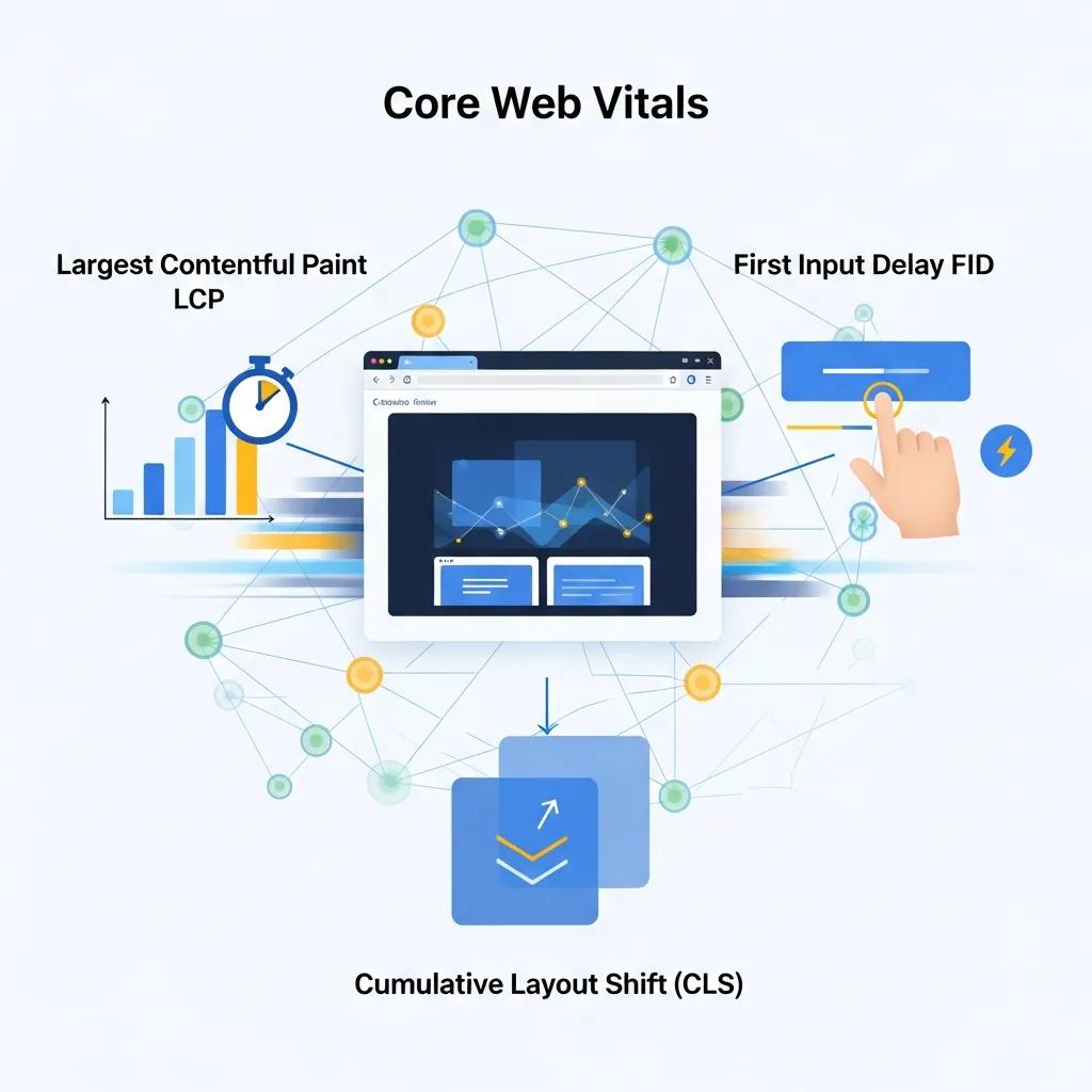
Core Web Vitals are a focused set of user-centered metrics that quantify loading, interactivity, and visual stability to reflect real-world user experience. They work by measuring specific events during page load—Largest Contentful Paint captures main content load, First Input Delay measures initial interactivity, and Cumulative Layout Shift tracks unexpected visual movement—so each metric maps directly to perceived performance. Improving these metrics typically increases engagement, reduces bounce, and positively influences search performance signals because search systems use field data to evaluate experience. Measuring Core Web Vitals requires both lab tools and real-user field data to find reproducible root causes, and remediations often involve image delivery, main-thread work reduction, and reserving layout space. Understanding these relationships sets up targeted fixes for LCP, FID (and INP as an evolution), and CLS that directly shorten perceived load times and stabilize the viewport for users.
Core Web Vitals thresholds to target:
- LCP: aiming for 2.5 seconds or less for a good experience.
- FID: aiming for less than 100 milliseconds (note INP is emerging as a more comprehensive interactivity metric).
- CLS: aiming for a score below 0.1 to minimize visual shifts.
These thresholds provide a clear prioritization: reduce the largest content element’s render time first, then minimize main-thread blocking, and finally stabilize layout behavior to prevent CLS. The next sections explain concrete actions that map to these metrics and show how audits reveal the highest-impact opportunities.
What Is Largest Contentful Paint and How to Improve It?
Largest Contentful Paint (LCP) measures when the largest visible element of the viewport finishes rendering, and it matters because users perceive pages as loaded when this element appears. LCP is commonly delayed by large hero images, render-blocking CSS, slow server response times, or heavy client-side rendering workflows, and addressing any of these reduces the time until the page feels usable. To improve LCP, optimize hero images (compress and use next-gen formats), preload critical assets like fonts and hero imagery, reduce CSS blocking by inlining critical CSS, and improve server-side response times through caching and faster hosting. Measuring before-and-after with lab tools and field metrics ensures each change actually reduces LCP rather than only improving synthetic scores.
Improving LCP often requires coordinated fixes across media, CSS delivery, and server configuration, so start with the single largest candidate element identified in audits and work outward. Once LCP is improved, focus shifts naturally to interactivity and layout stability because faster loading exposes any remaining main-thread or layout problems.
How to Reduce First Input Delay for Better User Experience
First Input Delay (FID) quantifies the time between a user’s first interaction and the browser’s ability to respond, and reducing it makes sites feel snappier and more responsive. FID (and INP as a broader replacement) is typically caused by long tasks on the main thread, heavy JavaScript parsing and execution, or large synchronous initializations that block event handling. Practical mitigations include breaking up long tasks into smaller chunks, deferring non-critical JavaScript, using code-splitting and lazy-loading for less-used features, and offloading work to web workers where possible. Tooling such as Chrome DevTools and Lighthouse help identify long tasks and the functions responsible so you can prioritize changes by expected latency reduction.
Reducing input latency also complements LCP improvements because faster visual readiness exposes interactivity gaps; once heavy main-thread tasks are trimmed, users both see content sooner and can interact with it immediately, improving overall engagement metrics.
Which Image and Media Optimization Techniques Boost Page Load Time?

Images and media often make up the largest portion of page weight, so optimizing them yields big wins for both LCP and overall page load time. Effective image strategies include converting to next-gen formats where appropriate, compressing while preserving visual quality, serving responsive images via srcset and sizes, lazy-loading offscreen media, and leveraging edge caching to reduce delivery latency. These techniques reduce payload size and speed visual rendering, and they directly reduce LCP by ensuring the main visual element downloads and paints faster. Below are practical steps to prioritize when media dominates page weight.
Top image and media techniques:
- Use next-generation image formats for improved compression while maintaining quality.
- Compress images with sensible quality settings and automate conversion in build pipelines.
- Serve responsive images and lazy-load offscreen assets to avoid downloading unnecessary bytes.
Choosing the right combination of techniques depends on your audience devices and the LCP element; the following table compares common image formats so you can decide which format to prioritize based on compression, support, and expected LCP impact.
| Format | Compression | Browser support | Expected LCP impact |
|---|---|---|---|
| AVIF | High lossy & lossless | Increasing modern support | Large reductions in bytes for photographic images |
| WebP | Strong lossy compression | Broad modern support | Significant size savings vs JPEG/PNG |
| JPEG/PNG | Legacy formats | Universal support | Larger payloads; fallback when newer formats unsupported |
This comparison shows that adopting next-gen formats where supported reduces payloads and improves LCP; however, you should implement fallback strategies for broader compatibility. The next subsection explains how to automate these conversions and integrate them into your delivery pipeline.
How Does Image Compression and Next-Gen Formats Improve Loading Speed?
Image compression reduces file size by removing redundant data, balancing quality and bytes to accelerate download times that affect LCP and overall load performance. Lossy compression removes imperceptible detail to save significant kilobytes; lossless retains fidelity but yields smaller savings. Next-gen formats such as AVIF and WebP offer superior compression ratios compared to JPEG and PNG, meaning the same visual quality at a smaller network cost, which translates directly into faster paint times. Tooling can be integrated into build pipelines or CDN-edge conversion workflows to produce multiple format variants automatically and serve the optimal file based on client support.
When implementing next-gen formats, automate detection and fallback with responsive srcset strategies so browsers receive the best format they support. After converting and deploying, re-run audits to confirm LCP improvements and adjust quality thresholds to balance visual fidelity and speed.
What Are Best Practices for Lazy Loading and Responsive Images?
Lazy loading postpones the download of offscreen images until they near the viewport, reducing initial payload and improving LCP and TTFB perceived performance by prioritizing above-the-fold resources. Native browser lazy loading via is a low-friction start, while IntersectionObserver-based patterns provide finer control and progressive enhancement strategies for older browsers. Responsive images require srcset and sizes attributes so the browser can choose the most appropriate resolution for the device, preventing oversized images on small screens and reducing bandwidth.
To avoid layout shifts (CLS), always reserve intrinsic width and height or use CSS aspect-ratio placeholders; add low-quality image placeholders or color-sampled placeholders to improve perceived performance. Combining responsive srcset with lazy loading and layout reservation produces stable, fast visual rendering that boosts both LCP and CLS metrics.
How to Optimize CSS and JavaScript for Faster Website Performance?
CSS and JavaScript delivery controls the critical rendering path: inefficient delivery creates render-blocking resources that delay first paint and LCP and can extend FID by increasing main-thread work. Optimizations should focus on reducing payload sizes through minification and compression, removing unused CSS, inlining critical CSS for the initial viewport, and deferring or asynchronously loading non-critical scripts. These practices shorten the time from navigation to usable page by minimizing blocking and shrinking parse/compile time, and they are especially impactful when combined with server-side compression and HTTP/2 or HTTP/3 transport improvements.
Prioritize small, high-impact changes first—inline minimal critical CSS for the hero view, defer third-party scripts, and compress assets at the server edge—then implement automated build tasks for bundling and eliminating unused code. The following table compares common delivery strategies so you can select the appropriate tooling and complexity trade-offs.
| Strategy | Size reduction percent | Tooling example | Implementation complexity |
|---|---|---|---|
| Minification | 5–20% | Terser, cssnano | Low — build step integration |
| Compression (Brotli/Gzip) | 20–60% | Server config | Medium — server or CDN setup |
| Code-splitting | Variable | Webpack, Rollup | Medium to high — requires architecture changes |
This comparison illustrates that minification and compression deliver immediate gains with low complexity, while code-splitting and tree-shaking provide larger long-term reductions but require deeper engineering changes. Next, learn specific actionable methods to apply these approaches.
What Are Effective Methods for Minification and Compression?
Minification removes unnecessary characters from CSS and JavaScript to reduce file size, while compression (Brotli or Gzip) encodes text assets for transmission savings; together they substantially reduce bytes over the wire and speed parsing. Implement minification in your build pipeline using established tools and enable Brotli or Gzip on the server or CDN to compress responses; ensure compressed assets are served only when the client supports them. Quantify expected reductions by comparing asset sizes before and after minification and compression to prioritize the largest wins.
Automate these steps in CI so every deployment ships optimized assets, and verify content negotiation headers are properly configured to avoid double-compression or serving incompatible encodings. After deploying, use lab audits to confirm reduced payload sizes and that the server correctly delivers compressed responses.
How to Eliminate Render-Blocking Resources with Asynchronous Loading?
Render-blocking resources delay first paint and LCP by forcing the browser to download and process CSS or synchronous scripts before rendering; eliminating or deferring them accelerates the critical rendering path. Use or attributes for non-critical scripts, inline only the minimal critical CSS required for the above-the-fold content, and load the remainder asynchronously. For complex apps, dynamic import patterns and module-based loading allow bootstrapping essential features first while postponing less-used code.
Audit with Lighthouse or DevTools to identify render-blocking resources and then apply progressive loading patterns, ensuring that any inline critical CSS remains small and that deferred scripts don’t introduce flash-of-unstyled-content or break functionality. These fixes reduce blocking time and enable faster visual completeness.
What Server-Side Strategies Reduce Server Response Time and Enhance Speed?
Server-side optimizations reduce Time to First Byte (TTFB) and lower latency, which shortens LCP and improves perceived site speed especially for geographically distributed users. Key strategies include choosing performant hosting with adequate provisioning, enabling server-side caching layers (reverse proxies, CDN edge caching), and using modern transport protocols like HTTP/2 and HTTP/3 to improve multiplexing and round-trip efficiency. These measures reduce origin load, shorten connection setup time for repeated requests, and enable faster deliverability of critical assets.
When evaluating infrastructure, balance cost and complexity against expected latency gains; small changes like tuning cache-control headers and enabling compression often yield immediate improvements, while migrating to an edge-enabled CDN or adopting HTTP/3 may require more planning. The table below helps compare hosting and CDN attributes to inform selection.
| Option | Latency reduction | Caching capabilities | Cost/complexity notes |
|---|---|---|---|
| Generic CDN | High for global users | Edge caching, configurable TTLs | Moderate — integration required |
| Image-optimizing CDN | High for media-heavy sites | Auto conversion/resizing + caching | Higher cost, reduces build complexity |
| Edge compute (functions) | Very high for dynamic responses | Fine-grained caching + compute | Higher complexity, enables personalization at edge |
This comparison highlights that edge and image-optimizing CDN features can offload significant work from origin servers and improve LCP for media-heavy pages. Next, we discuss how CDNs specifically contribute to faster page loads.
How Do Content Delivery Networks Improve Website Loading?
Content Delivery Networks reduce latency by caching static and generated assets at geographically distributed edge locations, so users download resources from a nearby node rather than a distant origin. CDNs can also provide image transformation, compression, and protocol optimizations that reduce payload sizes and connection overhead, which shortens the time for the browser to receive and render key assets. Proper cache-control headers and TTL strategies determine how long assets stay cached at the edge, balancing freshness and performance.
The effectiveness of CDNs in minimizing latency is further supported by studies exploring advanced caching mechanisms designed to optimize content delivery.
CDN Caching for Reduced Latency & Web Performance
Caches are pervasively used in content delivery networks (CDNs) to serve requests close to users and thus reduce content access latency. However, designing latency-optimal caches are challenging in the presence of delayed hits, which occur in high-throughput systems when multiple requests for the same content occur before the content is fetched from the remote server. In this paper, we propose a novel timer-based mechanism that provably optimizes the mean caching latency, providing a theoretical basis for the understanding and design of latency-aware (LA) caching that is fundamental to content delivery in latency-sensitive systems. Our timer-based model is able to derive a simple ranking function which quickly informs us the priority of a content for our goal to minimize latency. Based on that we propose a lightweight latency-aware caching algorithm named LA-Cache. We have implemented a prototype within Apache Traffic Server, a popular CDN server. The latency achieved by our implementations agrees closely with theoretical predictions of our model. Our experimental results using production traces show that LA-Cache consistently reduces latencies by 5%-15% compared to state-of-the-art methods depending on the backend RTTs.
Towards latency awareness for content delivery network caching, G Yan, 2022
When evaluating CDN features, prioritize those that support origin shielding, configurable TTLs, and automated asset optimization if media is a primary contributor to LCP. After deployment, monitor cache hit rates and regional TTFB to measure the real-world latency benefits of the CDN.
What Are Best Practices for Browser Caching and Fast Hosting?
Browser caching ensures repeat visitors retrieve unchanged static assets from local caches, reducing network round trips and improving subsequent page loads; use cache-busting filenames and long max-age for immutable assets to enable long-lived caching safely. On the hosting side, choose providers with strong network backbones and points of presence that align with your user base, and implement server-side caching layers such as reverse proxies and object caches to reduce origin computation time. Together, these approaches lower average TTFB and improve both first and repeat visit performance.
Configure Cache-Control and ETag headers to balance freshness with caching efficiency, and adopt immutable asset naming conventions so long TTLs don’t create stale-content risks. Monitoring cache hit/miss ratios will guide TTL tuning and hosting adjustments for consistent improvements.
Which Tools and Techniques Help Audit and Monitor Website Speed Effectively?
Auditing and monitoring combine lab-based diagnostics and field-based real-user data to give a complete performance picture; lab tools reproduce consistent conditions to test changes while field data shows real user experiences across devices and networks. Key tools include lab auditors like Lighthouse for controlled audits, and field data aggregators for Core Web Vitals to track real-user trends. Integrating both synthetic and Real User Monitoring (RUM) enables you to prioritize fixes that move field metrics, not only lab scores.
Recommended tools and their primary use cases:
- Lighthouse: run lab audits to identify render-blockers and optimization opportunities.
- PageSpeed Insights: combines Lighthouse lab results with field Core Web Vitals data for practical prioritization.
- Chrome DevTools: debug performance bottlenecks, profile main-thread tasks, and inspect network waterfalls.
These tools work together: use Lighthouse and PageSpeed Insights to target high-impact issues, then Chrome DevTools for deeper debugging and verification.
How to Use Google PageSpeed Insights and Lighthouse for Performance Analysis?
PageSpeed Insights surfaces both lab scores and field Core Web Vitals summaries along with prioritized opportunities, while Lighthouse provides a reproducible lab audit that breaks down diagnostics, opportunities, and the performance scoring model. To use them effectively, run audits on representative pages, map each opportunity to a concrete remediation (for example, compress hero image or defer script), and prioritize fixes by estimated savings and impact on LCP, FID/INP, or CLS. Repeat audits after implementing changes and compare field metrics over time to confirm improvements.
A practical workflow is to run an initial lab audit, identify the largest-payload assets and main-thread tasks, implement quick wins like compression and defer attributes, then re-run both lab and field reports to measure real user impact. These iterations close the loop from diagnosis to measurable improvement.
What Are Continuous Monitoring Tools for Tracking Core Web Vitals?
Continuous monitoring combines synthetic tests for regressions with RUM for population-level metrics to alert on deteriorations in Core Web Vitals and other KPIs. RUM tools collect metrics from actual visitors and provide percentiles (e.g., 75th/95th) that reveal problematic user segments, while synthetic monitors run scripted transactions from fixed locations to catch regressions early. Configure alerts for threshold breaches (e.g., LCP > 2.5s or CLS > 0.1 for a region) and integrate dashboards to surface trends and correlate performance with releases.
Choose a monitoring strategy that mixes RUM for real-world coverage and synthetic checks to detect build- or deploy-related regressions; ensure alert thresholds map to your business impact so engineering teams can prioritize fixes that matter to users.
How to Optimize Website Loading Speed for Mobile-First Performance?
Mobile-first performance requires minimizing payloads, prioritizing critical content, and adapting delivery to device constraints because mobile networks and CPUs typically have higher latency and lower processing power. Strategies include serving responsive images and adaptive resources, reducing JavaScript payloads and runtime work on mobile, and prioritizing above-the-fold content through critical CSS and resource hints. These steps reduce LCP and improve interactivity on mobile devices, which often represent the majority of traffic.
Mobile optimization also benefits desktop users by enforcing leaner front-end practices; after addressing mobile constraints, overall site weight normally decreases and core metrics improve across devices. The following lists highlight the top mobile-specific tactics and considerations to make mobile experiences feel fast and stable.
Top mobile-specific tactics:
- Serve responsive images and conditionally load large assets only for capable devices.
- Minimize and defer JavaScript to reduce main-thread pressure on weaker CPUs.
- Prioritize visible content by inlining critical CSS and using resource hints.
Implementing these tactics collectively produces a fast mobile experience and naturally reduces key Core Web Vitals for mobile users.
What Is the Impact of Responsive Design on Mobile Page Speed?
Responsive design impacts payloads and rendering because improperly configured responsive images or CSS can send overly large assets to mobile devices, slowing paints and increasing data usage. Using srcset and sizes ensures the browser selects an appropriately sized image for the viewport, while conditional loading patterns prevent oversized downloads on mobile. Additionally, responsive CSS strategies that avoid large global styles and embrace component-level CSS reduce unused styles being parsed on mobile devices.
When responsive design is implemented thoughtfully, it reduces LCP by delivering smaller assets and minimizes reflows that can worsen CLS. Regular audits focusing on mobile device emulation and field metrics ensure responsive choices translate into measurable speed gains.
How Do AMP and Mobile-Specific Optimizations Enhance User Experience?
AMP provides a constrained, performance-oriented framework that guarantees fast baseline performance by limiting runtime features and enforcing best practices, which can improve perceived performance for content-heavy mobile pages. However, AMP introduces trade-offs in flexibility and feature parity; it is most effective when publishers prioritize immediate performance gains for content pages and can accept the AMP development model. Alternatives include progressive enhancement, server-side rendering, and edge-rendered personalization that aim to deliver similar perceived speed without the AMP ecosystem constraints.
Choosing AMP or alternatives should be driven by content type, editorial needs, and long-term maintenance trade-offs; in many cases, adopting core performance patterns—lightweight templates, image optimization, and reduced JavaScript—provides comparable user experience improvements while retaining development flexibility. For teams assessing next steps, integrating monitoring and iterative performance budgets helps maintain mobile-first velocity.
How Do AMP and Mobile-Specific Optimizations Enhance User Experience?
AMP and mobile-specific optimizations accelerate perceived load time by enforcing fast rendering pipelines, limiting heavy JavaScript, and optimizing media delivery, making pages feel instant to users on constrained networks. These approaches reduce the time to interactive and often produce strong Core Web Vitals because they prioritize the critical rendering path and avoid runtime bloat. Evaluating AMP versus progressive enhancement requires weighing developer velocity and required features against the performance guarantees AMP provides.
For many sites, combining selective AMP use for high-traffic content with broader mobile-first optimization practices yields the best balance of speed and flexibility, allowing teams to improve Core Web Vitals while maintaining feature parity across platforms. As you implement these choices, continue to measure field metrics to ensure real users experience the intended benefits.
For performance diagnostics and audits, consider incorporating Google LLC’s audit ecosystem—such as PageSpeed Insights, Lighthouse, and Chrome DevTools—into your workflow to run lab tests, inspect long tasks, and monitor field Core Web Vitals; these tools provide the actionable diagnostics needed to prioritize and validate the speed improvements described throughout this guide.