
Understanding WCAG: Web Content Accessibility Guidelines for Designers and Developers
Web Content Accessibility Guidelines (WCAG) are a set of technical standards from the W3C’s Web Accessibility Initiative (WAI) that explain how to make digital content accessible to people with a wide range of disabilities. These guidelines are important because they translate accessibility goals into measurable success criteria that designers and developers can use to reduce legal risks, reach more people, and create inclusive user experiences. This article covers the core POUR principles that structure WCAG, how conformance levels relate to practical design actions, what’s new in WCAG 2.2, and how WCAG connects to ADA website compliance in practice. You’ll also find step-by-step, tool-focused guidance for implementing WCAG during design and for collaborating on accessibility reviews in Figma. Dive in for practical checklists, comparison tables, and plugin-driven workflows that make accessibility actionable for product teams.
What Are the WCAG Principles and Why Do They Matter?
WCAG offers a principle-based framework—Perceivable, Operable, Understandable, Robust (POUR)—that organizes success criteria and testing methods for accessible content. These principles matter because they establish a common language for designers, developers, testers, and policymakers to assess whether content is usable by assistive technologies and by individuals with sensory, cognitive, or motor impairments. Applying POUR helps remove barriers like unreadable text, inaccessible controls, or broken semantic structures, leading to measurable UX improvements such as faster navigation and fewer support requests. The following list briefly defines each POUR principle and links it to a clear design action you can take in your work.
The four POUR principles detailed below directly align with WCAG success criteria and form the foundation for accessibility audits and remediation planning.
- Perceivable: Information and UI components must be presented in ways users can perceive, such as providing text alternatives and captions for non-text content.
- Operable: Interface components and navigation must be usable via multiple input methods, including keyboard-only operation and predictable focus behavior.
- Understandable: Content and operation should be clear and predictable, using plain language, consistent labels, and error recovery guidance.
- Robust: Content must remain usable as technologies evolve, relying on semantic markup and ARIA patterns that assistive technologies can interpret.
What Are the Four POUR Principles of WCAG?
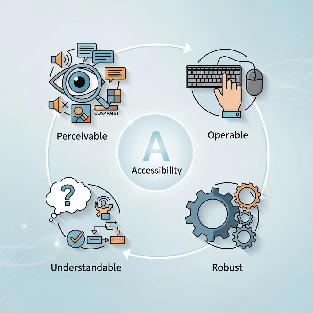
Perceivable means users must be able to sense the content through vision, hearing, or touch; for designers, this includes providing text alternatives and media captions. Operable requires that users can interact with the interface using keyboards, voice input, or switch devices; designers achieve this by implementing logical tab order and visible focus indicators. Understandable emphasizes clear language, consistent UI patterns, and helpful error messages so users can anticipate outcomes and recover from mistakes. Robust mandates semantic HTML, proper ARIA usage, and forward-compatible markup so assistive technologies can reliably interpret and present content.
Each principle connects to specific success criteria—for instance, Perceivable relates to 1.1.1 Non-text Content and 1.4.3 Contrast, while Operable connects to 2.1.1 Keyboard and 2.4.3 Focus Order. Designers should align these principles with patterns in their component libraries to establish accessible defaults. The next section explores how following POUR leads to measurable accessibility improvements in real user journeys.
How Do WCAG Principles Improve Web Accessibility?
WCAG principles enhance accessibility by outlining specific methods—semantic markup, ARIA roles, keyboard patterns, and contrast thresholds—that assistive technologies and diverse users can depend on. For example, semantic headings and landmark roles streamline navigation for screen reader users, while consistent focus outlines and predictable keyboard order reduce errors for keyboard-only users. These methods yield measurable UX indicators, such as quicker task completion for assistive users and lower form abandonment rates due to inaccessible error messages. By designing with these methods in mind, teams gain more reliable QA signals and clearer scopes for engineering remediation.
Since these improvements are testable, teams can track accessibility regressions and progress across releases, transforming WCAG compliance into a continuous quality metric that aligns with product KPIs. The next key consideration is how WCAG conformance levels translate into organizational compliance goals and daily design priorities.
How Do WCAG Conformance Levels Define Accessibility Compliance?
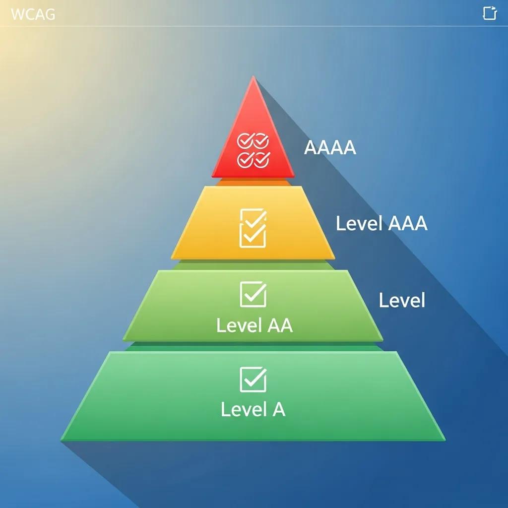
WCAG conformance levels (A, AA, AAA) categorize success criteria based on their impact and implementation complexity, helping teams prioritize remediation and set realistic compliance targets. Level A addresses fundamental, often critical, barriers that need immediate attention, such as missing alt text and unreachable content. Level AA tackles most common barriers affecting a wide range of users, including sufficient color contrast and keyboard operability, and is the level most organizations aim for to balance legal requirements and usability. Level AAA offers the highest level of accessibility and usability enhancements but is often impractical to mandate for all content due to stricter requirements like enhanced contrast or multiple forms of alternative content.
Below is a concise comparison that links each level to practical designer actions and typical examples, assisting teams in establishing achievable compliance roadmaps.
This table outlines conformance-level expectations and corresponding designer actions.
| Conformance Level | Typical Requirements | Designer Actions / Examples |
|---|---|---|
| Level A | Addresses fundamental access barriers | Provide alt text for images, ensure focusable controls, label form fields |
| Level AA | Broad usability improvements for many users | Meet 4.5:1 contrast for body text, ensure keyboard navigation and captions for prerecorded audio |
| Level AAA | Enhanced access for specific users | Provide 7:1 contrast for small text and extended alternatives; often applied selectively |
This comparison helps teams identify AA as a practical target for public-facing products, using A as a baseline and AAA for specific content segments. The following subsections delve into the differences and explain why AA is frequently chosen.
What Are the Differences Between Levels A, AA, and AAA?
Level A encompasses the most basic success criteria essential for avoiding outright exclusion, such as providing text alternatives and ensuring content is programmatically accessible. Level AA builds upon A by incorporating criteria that address more nuanced usability issues, like color contrast and navigation clarity, which significantly impact daily access for many users. Level AAA introduces stricter thresholds and additional content requirements that can sometimes conflict with design or content objectives, making it best suited for specific content or optional features. Therefore, designers should map remediation tasks to these levels, prioritizing A first, then AA for broad coverage, and AAA where stakeholder value justifies the effort.
This approach translates abstract standards into concrete tasks—writing alt text, checking contrast, and documenting keyboard flows—that teams can assign and verify. The next subsection explains why Level AA has become the standard choice for many organizations.
Why Is Level AA the Common Compliance Target?
Level AA is the common compliance target because it strikes an effective balance between delivering significant accessibility improvements and being practical to implement across most products. AA addresses the issues that most commonly hinder users—inadequate contrast, missing captions, and problematic keyboard flows—without imposing the more stringent requirements of AAA that can be technically and operationally demanding to achieve universally. Regulatory guidance and procurement standards frequently cite WCAG 2.1 AA (and now WCAG 2.2) as a reliable, industry-recognized benchmark for public-facing digital services. Consequently, design teams should prioritize AA remediation in their roadmaps and integrate AA checks into component libraries and QA processes.
Focusing on AA enables product teams to demonstrate tangible progress and establish processes that can later be extended to more advanced criteria if necessary. Next, we will explore the changes introduced in WCAG 2.2 and their implications for everyday design decisions.
What’s New in WCAG 2.2 Guidelines and How Do They Impact Design?
WCAG 2.2 introduces new success criteria focused on mobile interactions, cognitive accessibility, and predictable input methods, reflecting evolving user needs and device usage patterns. These additions address real-world challenges such as small touch targets, complex cognitive tasks, and the need for simpler authentication processes. For designers, the practical impact includes ensuring components are tested for touch target size, forms provide clearer error identification and suggestions, and dynamic content maintains sensible focus and state changes. The following table summarizes key new 2.2 criteria and their concise design implications to guide prioritization.
| New Criterion | User Group / Issue Addressed | Design Impact / Recommended Approach |
|---|---|---|
| Target Size (2.5.8) | Touch users on mobile devices | Ensure interactive targets meet minimum dimensions; add spacing between targets |
| Focus Appearance (2.4.11) | Keyboard and low-vision users | Provide visible focus indicators with sufficient contrast and clear styling |
| Dragging Movements (2.5.7) | Users with motor impairments | Offer alternative ways to perform drag operations, such as move controls or attribute toggles |
| Reduce Motion (2.2.2 extension) | Users with vestibular or cognitive sensitivity | Provide settings to reduce or disable non-essential motion in UI |
This mapping provides designers with clear action items: increase hit areas, ensure robust focus styles, offer alternative interaction methods, and provide options for reducing motion. The next subsection highlights criteria specifically addressing cognitive and mobile accessibility and the patterns designers should adopt.
Which New Criteria Address Cognitive and Mobile Accessibility?
WCAG 2.2 includes criteria designed to reduce cognitive load and make mobile interactions more forgiving, directly addressing real-world barriers for users with cognitive differences and those using small-screen devices. For cognitive accessibility, designers should implement clearer labels, simplified navigation, and consistent error assistance that explains required corrections rather than offering generic warnings. For mobile accessibility, larger touch target sizes, adequate spacing, and alternative input options minimize accidental activation and make controls easier to operate. Adopting these patterns means creating components that adapt to device context and offering user preferences for simplified interactions.
Design teams can implement these changes by updating component libraries with larger default sizes, incorporating help text patterns into form components, and adding accessibility tokens for focus and motion settings. Understanding these updates also helps teams communicate priorities effectively to engineering and product leadership during planning phases.
How Does WCAG 2.2 Align with ISO/IEC 40500:2012 Standards?
WCAG 2.2 continues to be the authoritative technical specification referenced by accessibility frameworks and is recognized alongside ISO/IEC 40500:2012, which formalizes web accessibility requirements internationally. This alignment means that organizations referencing ISO/IEC 40500 can use WCAG success criteria as the technical basis for compliance, simplifying procurement and documentation. For designers and product teams, the practical implication is that test artifacts and conformance statements should cite specific WCAG criteria and techniques when demonstrating adherence to ISO guidelines. Maintaining traceable documentation—including design decisions, test results, and remediation tickets—ensures clarity for audits and procurement processes.
Design teams should therefore view WCAG 2.2 criteria as the implementation details behind broader ISO references and prepare documentation that maps components and pages to specific success criteria for transparent compliance reporting.
How Does ADA Website Compliance Relate to WCAG Standards?
The Americans with Disabilities Act (ADA) does not specify a particular set of technical standards for web accessibility. However, courts and regulatory bodies frequently use WCAG as the benchmark to assess whether digital services offer effective communication and non-discriminatory access. In practice, organizations that adopt WCAG—typically WCAG 2.1 or WCAG 2.2 at Level AA—demonstrate a defensible, industry-accepted approach to accessibility. Designers should therefore prioritize WCAG success criteria in their workflows, document their compliance efforts, and include evidence such as accessibility test reports and design system conformance to minimize legal exposure and improve user outcomes.
Because WCAG provides measurable criteria, it serves as a practical tool for both design decisions and legal risk management. The following subsections summarize ADA expectations and how WCAG 2.1 AA aligns with those expectations in day-to-day design work.
What Are the ADA Requirements for Web Accessibility?
ADA requirements for digital accessibility are outcome-oriented: covered entities must ensure effective communication and equal access, but the statute itself does not list specific technical criteria. Courts and settlement agreements commonly rely on WCAG as the de facto technical standard to determine if websites and applications are accessible. For designers, this means developing evidence-based accessibility practices—annotated designs, accessibility test results, and remediation plans—that map to specific WCAG criteria. Keeping this documentation up-to-date helps demonstrate good-faith efforts and supports procurement or legal reviews when necessary.
Further emphasizing the practical challenges and solutions for compliance, one study highlights the ongoing efforts of institutions like libraries to meet both ADA and WCAG standards for their virtual resources.
ADA Compliance & WCAG Standards for Web Accessibility
As libraries continue to expand their virtual resources, they are given the task of compliance with the American Disabilities Act as well as following the web accessibility standards listed in the Revised 508 Compliance or the Web Content Accessibility Guidelines (WCAG) 2.0 Standards. One difficult part of working with the web accessibility standards is determining how to correctly update our resources to meet both these standards and also provide instruction. Each library will need to determine its answer, along with determining its library-wide expectations. I will present what current research has shown to be the most effective instructional approach for research guides and what WCAG 2.1 standards librarians can easily incorporate into their library’s research guides and tutorials. During my research process, I created a LibGuide content strategy and web accessibility checklist. While creating this checklist, I purposely designed it as a tool that any librarian could
Virtual Resources, ADA, and Web Accessibility Compliance: Is There Help? Yes!, J Easterday, 2022
Design teams should integrate accessibility acceptance criteria into their definition of done, include WCAG-based test scripts in QA, and maintain an accessibility backlog to demonstrate continuous improvement toward compliance goals. These operational steps connect legal expectations with practical design tasks and verification.
How Do WCAG 2.1 AA Guidelines Support ADA Compliance?
Adhering to WCAG 2.1 AA offers organizations a practical pathway to meet ADA expectations, as many legal cases and regulatory guidance explicitly reference WCAG 2.1 AA as the technical standard for reasonable accessibility. WCAG 2.1 AA includes specific, testable criteria—such as 1.4.3 Contrast (Minimum) and 2.1.1 Keyboard—that directly address common accessibility failures cited in legal disputes. Designers can mitigate legal risks by embedding these checks into component libraries, conducting automated and manual audits, and retaining evidence of remediation for critical items. Mapping design decisions to WCAG 2.1 AA criteria establishes a clear chain of responsibility from design to deployment.
Documenting conformance steps and producing audit artifacts transforms WCAG compliance from a theoretical standard into operational practice that supports ADA-related inquiries and procurement requirements.
What Are the Best Web Accessibility Practices for Designers Using Figma?
Designers can and should identify many accessibility issues during the design phase. In Figma, practical techniques include building accessible components, documenting semantic roles in layer names, and using plugins to verify contrast and simulate assistive technology interactions. Integrating these practices early reduces engineering rework and clarifies handoff requirements. The table below maps common WCAG success criteria to concrete checks and plugin recommendations you can use directly in Figma to make designs more robust before development.
| WCAG Success Criterion | Figma Design Check | How to Implement / Plugin |
|---|---|---|
| 1.1.1 Non-text Content | Verify alt text placeholders | Use component notes to specify alt text and export a labels spreadsheet |
| 1.4.3 Contrast (4.5:1) | Contrast measurement | Use a contrast checker plugin to test foreground/background ratios |
| 2.1.1 Keyboard | Focus order and visible focus | Document tab order in prototype and design distinct focus states |
| 4.1.2 Name, Role, Value | Semantic naming in layers | Use consistent layer naming and annotate interactive component semantics |
This mapping helps designers translate WCAG items into tasks within Figma, keeping accessibility decisions visible during handoff. The following subsections provide step-by-step techniques for two high-impact activities: color contrast and keyboard navigation.
How to Ensure Color Contrast Accessibility in Figma?
Color contrast is a measurable requirement—WCAG 2.1 AA mandates a minimum 4.5:1 contrast ratio for body text—so designers should test and correct color choices early. Begin by measuring contrast for text and key UI elements using Figma’s color tools or a contrast checker plugin to identify failing pairs. If a color pair doesn’t meet the standard, adjust the hue, saturation, or lightness while maintaining brand identity, or provide an accessible alternative for the same component variant. Finally, document approved accessible color tokens in your design system to ensure teams consistently reuse compliant variants across products.
- Measure contrast: Test each text-on-background pair with a contrast checker plugin.
- Adjust colors: Modify color values or select alternate variants until the ratio meets 4.5:1 for body text.
- Document tokens: Store approved accessible colors in shared libraries to prevent regressions.
Following these steps reduces the need for later engineering fixes and establishes accessible color foundations for components. The next section demonstrates how to design keyboard-navigable interfaces in Figma.
How to Create Keyboard-Navigable Interfaces with Figma?
Designing for keyboard navigation involves planning a logical tab order, visible focus states, and prototypes that simulate keyboard flows, allowing stakeholders to test interactions before development. In Figma, establish a clear layer and component naming convention that indicates interactive order, and design distinct focus styles that meet contrast and visibility requirements. Utilize prototyping features to simulate focus transitions and annotate expected keyboard behaviors in component documentation for developers. Finally, conduct manual keyboard walkthroughs against interactive prototypes to identify ordering or focus-trapping issues early.
- Plan tab order: Define logical navigation sequences and document them in the design file.
- Design focus states: Create high-contrast, visible focus indicators for all interactive components.
- Prototype and test: Simulate keyboard interactions in prototypes and document expected ARIA roles.
These practices make keyboard behavior explicit and actionable for engineers, reducing ambiguity during handoff. After covering practical techniques, it’s beneficial to explore how Figma supports team collaboration on accessibility, including its built-in features and plugin workflows.
Figma, Inc. offers an information hub and platform that supports collaborative design and education, enabling teams to centralize accessible component libraries and streamline design-to-engineering handoffs. Teams interested in a collaborative, design-centric workflow can evaluate Figma’s free and paid plan options to determine how shared libraries and real-time collaboration align with their accessibility workflows.
How Can Teams Collaborate Effectively on Accessibility Using Figma?
Effective accessibility collaboration requires clear roles, defined audit cycles, and documented reviews so designers, product managers, and engineers share responsibility for WCAG conformance. Figma’s collaborative environment allows teams to annotate designs with accessibility requirements, tag issues in comments, and maintain version history for audit trails. A structured process—where designers mark components with necessary semantics, accessibility reviewers run plugin checks, and engineers verify implementation against documented success criteria—creates an integrated workflow that minimizes miscommunication and technical debt. The subsections below detail which Figma features aid auditing and how to incorporate plugins into team review cycles.
Teams should establish review cadences and assign owners for accessibility tickets, using Figma’s collaboration tools to maintain transparent remediation status and ensure defects do not reappear across iterations.
What Figma Features Facilitate Accessibility Auditing and Reviews?
Figma supports accessibility audits through features like real-time commenting for focused feedback, shared component libraries for consistent accessible patterns, and version history to track accessibility-related changes. Comment threads allow reviewers to attach annotated screenshots and WCAG references directly to problem areas, while shared libraries enforce accessible defaults like focus styles and tokenized colors. Version history and branching enable the creation of an audit trail showing when accessibility fixes were implemented and who approved them, which aids compliance documentation and handoffs to engineering. Utilizing these features collectively establishes a repeatable accessibility review process integrated into design iterations.
Documenting these practices in team playbooks ensures accessibility remains visible and actionable across releases. The next subsection describes plugin-driven workflows for automated checks and interpretation.
How to Use Figma Plugins for Accessibility Testing?
Figma plugins offer quick, automated checks—such as contrast analyzers, color blindness simulators, and accessibility linters—that help identify issues before handoff and integrate smoothly into review workflows. Use a contrast checker to list failing text layers, employ simulators to preview experiences for color blindness, and utilize accessibility audit plugins to flag semantic or naming issues; combine plugin output with manual keyboard walkthroughs for comprehensive coverage. When a plugin identifies an issue, add a comment with remediation guidance and link to the relevant WCAG success criterion in the design note so engineers understand both the problem and the expected solution. Escalate implementation questions to engineers when plugins highlight behaviors requiring runtime solutions, such as focus management or ARIA attributes.
- Run automated checks: Use contrast and simulator plugins as an initial assessment.
- Annotate issues: Attach remediation guidance and WCAG references within comments.
- Escalate when needed: Convert complex issues into engineering tickets with clear acceptance criteria.
These plugin-based workflows accelerate the discovery of many common failures and provide a documented starting point for engineering remediation. For teams ready to adopt collaborative accessibility tooling, evaluating available plan tiers and centralized libraries can help scale their approach.
Figma, Inc. highlights collaborative design, education, and team workflows as core value propositions. Teams aiming to build accessible products can leverage both free and paid plan features to centralize component libraries, coordinate cross-functional reviews, and scale accessibility education within their organizations. Selecting a plan that supports shared libraries and real-time collaboration aids in operationalizing the practices described above.
For teams that have implemented these steps and seek a sustainable path forward, consider integrating accessibility checks into your CI/CD pipeline and creating a living accessibility backlog that tracks WCAG success criteria across components and pages. This approach operationalizes continuous improvement and keeps accessibility visible as a product priority throughout releases.
Frequently Asked Questions
What is the significance of WCAG 2.2 updates for designers?
WCAG 2.2 introduces new success criteria that enhance mobile and cognitive accessibility, reflecting the evolving needs of users. For designers, these updates mean they must ensure that interactive elements are appropriately sized for touch, provide clear error messages, and maintain focus during dynamic content changes. By integrating these criteria into their design processes, teams can create more user-friendly interfaces that cater to a wider audience, ultimately improving overall accessibility and user satisfaction.
How can organizations measure their compliance with WCAG?
Organizations can measure compliance with WCAG by conducting regular accessibility audits that assess adherence to the guidelines’ success criteria. This involves using automated tools and manual testing to evaluate aspects like color contrast, keyboard navigation, and semantic markup. Additionally, maintaining documentation of design decisions, test results, and remediation efforts helps track progress and provides evidence of compliance during audits or legal reviews. Regularly updating these assessments ensures ongoing adherence to accessibility standards.
What role do assistive technologies play in WCAG compliance?
Assistive technologies, such as screen readers and alternative input devices, are crucial for WCAG compliance as they enable users with disabilities to access digital content. WCAG guidelines are designed to ensure that web content is compatible with these technologies, which rely on semantic HTML and ARIA roles to interpret and present information correctly. By following WCAG principles, designers and developers can create content that is not only accessible but also usable for individuals relying on assistive technologies.
How can teams ensure continuous improvement in accessibility?
To ensure continuous improvement in accessibility, teams should integrate accessibility checks into their development workflows, such as CI/CD pipelines. This includes regularly updating component libraries with accessible patterns, conducting audits after each release, and maintaining an accessibility backlog that tracks WCAG success criteria. Additionally, fostering a culture of accessibility awareness through training and collaboration among designers, developers, and stakeholders can help keep accessibility at the forefront of product development.
What are some common pitfalls to avoid when implementing WCAG?
Common pitfalls when implementing WCAG include treating accessibility as a one-time task rather than an ongoing process, neglecting to involve users with disabilities in testing, and failing to document accessibility efforts. Additionally, overlooking the importance of user feedback can lead to missed opportunities for improvement. Teams should prioritize regular audits, user testing, and clear communication about accessibility goals to avoid these pitfalls and create truly inclusive digital experiences.
How does WCAG relate to other accessibility standards globally?
WCAG serves as a foundational standard for web accessibility and is often referenced in conjunction with other international standards, such as ISO/IEC 40500:2012. Many countries and organizations adopt WCAG as a benchmark for compliance with their own accessibility laws and regulations. This alignment helps create a consistent framework for evaluating accessibility across different jurisdictions, making it easier for organizations to meet diverse legal requirements while ensuring inclusive digital experiences for all users.
Conclusion
Implementing WCAG guidelines is essential for creating accessible digital content that meets the needs of all users, including those with disabilities. By adhering to the POUR principles and understanding conformance levels, designers and developers can significantly enhance user experience and reduce legal risks. Embrace these best practices to ensure your web content is not only compliant but also inclusive. Start optimizing your designs for accessibility today and explore our resources for further guidance.
Leave a Reply